
![]()
Welcome to Mignolaversity, Multiversity Comics’ dedicated column for all things Mike Mignola. We’re celebrating the twentieth anniversary of Christopher Golden and Mike Mignola’s Hellboy: The Bones of Giants novel and its new adaptation to comics with artist Matt Smith. Following the release of each new issue, we’re exploring different aspects of the series. This month we’re talking to writer Christopher Golden, artist Matt Smith, colorist Chris O’Halloran, letterer Clem Robins, and editor Katii O’Brien about their work on the miniseries through the lens of a single scene from “Hellboy: The Bones of Giants” #3, pages 15 to 17. This is an absolutely huge interview and everyone involved gave so much.
I hope you’ve enjoyed this series of interviews. In case you’ve missed any, here are the others:
- “Hellboy: The Bones of Giants” announcement
- Adapting Giants – Part 1: Foundations of Prose
- Adapting Giants – Part 2: The Covers of Giants
- Adapting Giants – Part 3: Designing for Comics
The scene we’ll be exploring was originally a seven-page sequence in Chapter 12 of the prose novel Hellboy: The Bones of Giants. I’ve isolated the relevant sections from the novel below.


These are the moments that most closely align with what ended up in the comic, but there’s quite a bit cut out here. Most notable of these are the bits involving Hellboy feeling like his own personality is being eroded away by Thor’s rage, and how much this scares him.
As I understand it, this sequence almost didn’t make it to the comic at all.
Christopher Golden: Adapting this was one of the hardest things I’ve had to do in comics. My very first comics gig was adapting Joe Lansdale’s novel The Drive-In into a four-issue miniseries, but that book is probably less than half the length of this one, and each issue was at least twenty-two pages, if not twenty-four. We had a total of eighty pages and a lot of difficult decisions had to be made. Some of those were about whole scenes and segments that had to go, but other decisions were about elements that had to go. That meant boiling down the “Hellboy is haunted by Thor and becoming more and more influenced by his presence” element of the novel into a few choice scenes that could get it across visually instead of spending time writing captions about it, or letting it play out in points where Hellboy’s behavior is different and using a lot of panel by panel real estate. The whole process was about the judicious selection of things that would let me balance telling the story effectively with the desire to give Matt the room to draw the stuff that makes him very happy.
So Christopher, talk us through your process of adapting this sequence to your script pages.
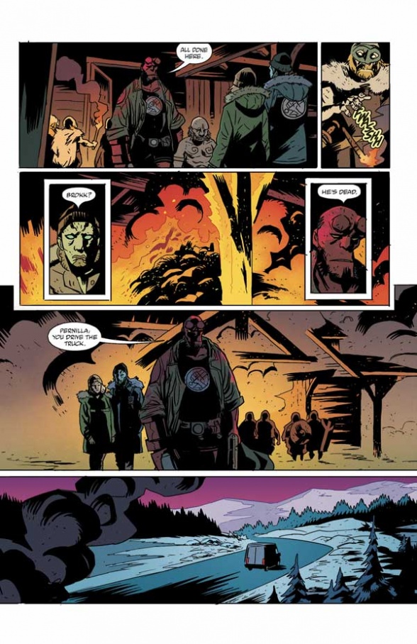
CG: I rely so much on Matt making the right decisions, and he always does. That first panel, the important thing is that the reader see Garm and the pile of corpses he’s lying on top of, like a dragon on its hoard. Garm doesn’t see anyone or anything as a threat, so when they come in, he doesn’t really care. Hellboy…just close your eyes and imagine Hellboy giving a deep sigh when he walks into this place. Like “Oh for Christ’s sake.” This is awful, so many people are dead, and there’s nothing he can do about that…and he’s in a hurry to get where he’s going, but he can’t just leave the giant Norse mythological monster here to eat whoever might come along next.
Continued belowThen there’s that inset, Hellboy saying “Shoot it.” It was Matt’s choice to lay it out that way. I knew the panel needed to be a small close up of Hellboy with that line, but the layout makes it work beautifully. What follows on page 15 had to be kind of a twist on the gunshot moment in the square in Cairo in Raiders of the Lost Ark. They try killing it by shooting the hell out of it, and that doesn’t work. So Hellboy realizes guns are not going to do the job–guns are a modern thing. To kill Garm is going to take Mjollnir, maybe the Right Hand of Doom, and maybe some furious dwarves.

On page 16, I noticed that you were able to take several moments in the fight and compress them into a single panel.
CG: All I can really say about that is that it helps when you have confidence the artist will pull it off. With what little room I had to work with, I didn’t have much of a choice if I wanted to include the sequence, but with Matt, I knew it would work.
I’d love to have had two more pages to show a battle here, but page 16 is really the whole thing. One of the Nidavellim is killed, but they are warriors. It’s sad, but not unexpected. They live with that knowledge every day. Hellboy feels it too, and some of that Thor-ness is showing through. They have a larger battle to come and putting this one behind them immediately is necessary.

While pages 15 and 16 compress a lot of material, page 17 covers only a few paragraphs. It slows the comic down and focuses on the mood more.
CG: I needed the part afterward, the exchange between Pernilla and Abe, to ground the moment. The idea that monsters are real, that myths are real, seems just as impossible to her as the idea that her father is dead, but both things are true. And then of course you have this quiet aftermath, where they burn the evidence of this impossible event and leave the world behind, heading north, as if they’ve somehow stepped out of the tangible world and into the mythological one. The moment needed quiet and solemnity.
Katii O’Brien: These quiet, mood-focused and character-focused moments are critical in any comic, but something we need to be extra careful to maintain when adapting a novel into a short comic series. It can be easy to let plot and action take the lead, but the story and characters need time to breathe, too.

Matt, when you first got these pages, what was your process in breaking them down into layouts?
Matt Smith: I’ve made the mistake of trying to get in everything from the written script to the detriment of the page plenty of times. I never want to be presumptuous, but I think what Christopher is looking for is to get the feel of what he is describing on a page—to get as much of the impact of what is happening across as I can. I try to stick pretty close but at the same time I’m thinking about all the details described. Can I fit them all in? And what would be the aggregate effect if I could? So, it’s things like those cool little lamps that get cut out. I wanted to put them in, but I mainly wanted you to be looking at that big wolf on his corpse throne.


I can definitely see that at work. Christopher’s description is very evocative, but all the details didn’t end up in the final panel. However, the mood is there and the focus is right where it should be.
MS: I hope I’m not getting hopelessly into the weeds right off the bat, but this is kind of my thinking process at the start—how to be respectful of the written script, as that’s the backbone of the whole thing—but make judgement calls when needed. Sometimes these changes require adjustments elsewhere, such as adding a torch into the hand of one of the dwarves on page 18. It’s a slippery slope for sure, I have to be sure that I’m not trying to take an easy way out but that this is the best way I know how to get the feel of what I’ve read across. This is something that it’s taken time to warm up to over the years, that not only is it ok to make choices interpreting the script but that the writer can be actually counting on you to do so.
Continued belowWhen I worked on my own book, I’d change things on the fly all the time as drawings in progress would sometimes affect how I saw the scene playing out. When I started working with a writer, as on Lake of Fire with Nathan Fairbairn, I took this stance of “the script is law” even though that was not coming directly from Nathan at all. Eventually I’d be forced to make some changes from the script as written for the greater good of getting the feel of the scene across and was then surprised to get positive feedback where I was expecting grumbling acceptance at best. Again, nothing to do with Nathan but my own idea of how this was all supposed to work. The short of it was learning a bit on how to be a good collaborator to the service of the book.
KO: Chris and Matt are an amazing team, and it’s clear working with them that they completely trust each other’s storytelling and are on the same page. If panels are added, omitted, combined, we editors will give it a close look to see what dialogue changes we might need to make so that everything lines up clearly for Clem, our letterer. We’ll also make sure that we hit the beats we need to and that anything we absolutely need to set up in the background is there, but as long as the storytelling is working then we just let Matt do his thing. And his storytelling is always working.
Looking at the script and the final pages, I couldn’t help notice when you chose to emphasize faces by including inset panels, especially since when reading the script, I couldn’t but but be aware that you can’t really show both Garm and Hellboy’s face at the same time, so every panel I was very aware when you were reversing the point of view, who’s face connected most with the critical information of that panel.

MS: That’s a thing I find myself constantly weighing, the importance of understanding how the scene is laid out, where the action is happening and getting across the feel that’s usually conveyed through facial expressions. It’s a basic comics mechanics issue I guess. We need to see the scale of things or the relation of objects/characters to each other but we also need to be there with the characters who are driving the story.
I think these issues are most prominently seen in the top tier of page 16, which was a single panel in the original script. In the open panel, you can see everything the script wants us to see, but the added inset gives us the character connection with Eitri.
But this augments the pacing too. By breaking the open panel with the inset, you have two panels that function like three as our eyes travel left to right.

MS: I wish I was clever enough to have thought of the pacing in this scene. Though I can see it now that you mentioned it! It was completely driven by wanting to show the scale difference, the action, and Eitri’s reaction. In the film version in my head, you cut to Eitri and maybe also a close up of the hands plunging the daggers in before Garm swats him off. I thought about another panel or inset showing that but wasn’t sure I should cut it up so much. It never got sketched out anyway. I’m sure there are other ways it could have been angled, but this was the only way I could see in my head to get across both the action and the reaction.
Page 17 gives weight to the previous two, slowing down as the characters take on the emotional baggage of these events. It’s also a crossing of a threshold. Up till now, the story has been largely grounded in the human world with supernatural intrusions. But after this sequence, and for the rest of the miniseries it’s very much the reverse (especially when the characters reach Utgard). I can feel that element at work in Christopher’s script, and I feel like you picked up on that and took it to the next level. Like the best collaborations, I feel like you are “Yes, and”-ing his work.
Continued below
MS: Ha! I like your way of putting it. I know I’ve said this before, but I was immediately taken with the original book. Chris just masterfully wove the voice of Hellboy and the atmosphere of the classic Norse mythology world together and I responded strongly to it. I hope he’ll forgive me for saying I wasn’t familiar with any of his works at the time I first encountered the book, it was Hellboy and Norse mythology and that’s all I needed to know. As I read it my thoughts often were “Yes!” and “This guy gets it!” I don’t know what my expectations were—it’s hard to go back twenty years—but I suppose I could have imagined one of those elements being strong and the other not. Mike’s Hellboy, a character defined not only by Mike of course, but predominantly in pictures—and now I’m reading a novel by another author. A lot could go wrong there. Then there’s the Norse mythology. There are lots of ways that could be represented, including skimming the surface and borrowing details of wolves, hammers, etc., but getting nothing of the weight and tone of it. So as I went through this book, I found myself just grinning and nodding; it’s the Hellboy I knew (and Abe of course) and it’s the Norse mythology I love.
I think I went way off-road with this question. I suppose what I meant to get across is that it was all there in Chris’ book and comic script. I just tried to not screw it up too badly for my part. I definitely kept in mind that this might be many reader’s first introduction to the story so there was no relying on having read the book first. The comic had to stand on its own.
Also, yes, for sure—this is the point where we really cross that threshold as you nicely put it. Really trekking up into the mountains and the grim stronghold being rebuilt there.
KO: Matt hits on something really critical here: with an adaptation, you cannot count on readers having read the original material. It needs to work on its own, to make sense and be engaging without any prior exposure to the novel. On the flip side, you want it to feel familiar and honest for readers who have read the original version, so it’s a balancing act.
You definitely tapped into something there. The last half of issue #3 feels so much like my own memories of first reading the novel. And when I was reviewing with James Dowling, who hasn’t read the original novel, he was still feeling that shift.

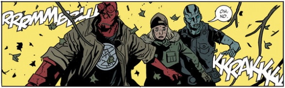
Speaking of building on what Christopher’s done, on the second tier of this page, you’ve taken what was scripted as a single panel and broken it into three. I really like this construction, because so little is said in the dialogue, you have to communicate the unspoken visually. This tier’s composition emphasizes the eyelines; Abe is framed front on, reinforcing that he is trying to meet Hellboy’s eyes, whereas Hellboy is framed at an angle, facing out toward the edge of the page, reinforcing that he’s avoiding eye contact. Then to really hammer home the point of the unspoken thing between them, there is the pile of burning corpses. This shows how panel compositions work in concert with one another to create a single moment—it’s part of how an artist performs the characters.
MS: I wish I could say these things are always intentional. I always see it as intentional when I look at other artist’s work and am impressed by it. I think sometimes that these moments work to the degree they do is a combination of the strength of the script and to no small degree what the reader brings to it. (You, Mark, in this case!) I suppose it’s no different than listening to an album or watching a film where you can take it on surface details, or get into it on another level and bring your own experiences, level of engagement and also prior knowledge of the characters/world to it.
Continued belowNow, if I haven’t lost everyone with this answer… Ha. My favorite examples of this are from Mike’s Hellboy work. So many times where things are left unsaid and it’s the composition of the panel or the page that nails the mood. It’d be hard to pick one example. “Hellboy in Hell” as a whole is a master class in this kind of thing.
I couldn’t help but notice that the final panel on the page changed its composition quite a bit in the inks. What was the reason for the change?

MS: If I remember right it was because I had more of an eagle’s eye view on the first panel of the following page. Just one of those times where I probably felt like I was drawing the same panel twice, or close enough. Either that or I was having a hard time with making it read properly and decided to switch the angle. I’d like to think it was the first one. Ha.
The final version of the panel definitely has more forward momentum, with the smoke on the the left of the panel and vehicle moving toward the right; the focus is on where it’s going and what it’s left behind.
So, let’s take a look at the final inks and how Chris O’Halloran colors them.


Chris, when you start on a new project, what sort of discussions do you have with the other creators?
Chris O’Halloran: Not a lot of discussion normally, but there are exceptions. Usually I’ll take in any notes the others might have or ideas they have in mind, if any. Most of the time I’ll just jump in on a page or two and show how I am seeing things. There can be discussion then from what I’ve presented and things develop from there. I’ve worked with Matt previously on “Folklords” so I don’t think we discussed anything really. We developed a look or understanding there that mostly transferred over to ‘The Bones of Giants.’
Additionally I’m hyper aware of Stewart’s work on Hellboy and his world. It’s my favorite color work and probably my main influence in my own work. I didn’t have to think or even look at much reference for this series as it’s burnt into my mind how I thought it should look. Nobody said “Make it look like classic Hellboy,” but that felt natural to do, or attempt at least.

I’m curious how the overall shape of the story informs your color choices. Like, for example, in this story everything will culminate in an environment full of blues against a character that is likewise predominantly blue. Acting against that is Mjollnir, which has yellow lightning. So the story ends with a clash of blue and yellow. I assume this is something then that flows backward through the story, so you can establish the ways blue and yellow connect to certain characters and plot elements.
When you first get the script and pages, what are you looking for as the foundation for your colors? How do you consider the overall shape of a story as opposed to the moment to moment stuff?
CO: Kind of like you’ve described here. I know that yellows and whites for the lightning are going to be used at some point for effect. The same with that blueish-green tone for the ending. So it’s a matter of staying away from those areas (or the bright in-your-face version of those at least) in the rest of the story so that they have impact when they do appear. Sometimes I know from reading the script or seeing the art what kind of tone or vibe a scene should be but sometimes it’s just a matter of using ones that haven’t been used much yet. It more or less goes without saying, red is used for one of the characters primarily, so even the flames stick on the orange side of the line and the blood splatter is on the pinker side of red.
Continued belowThis issue has more setting changes and jumps around more than most, I think, but I can’t say I plan it all out beforehand, a lot of it is just natural change keeping up with the story and art and hoping it all gels. Things like Fenrir being in the dark here and using dark blue/greens as the shadow he’s in make sense when you are going through them for me because I can link him to the ending colors a little and make a connection even though Yellow is his color kind of with the eyes. Even if no one picks up on it or it doesn’t make sense it’s something that helps me make a decision or justify it.

In this sequence, to punctuate moments of action the background color of a panel changes drastically from those around it, but you steered clear of yellow until Hellboy leaps in with Mjollnir raised—it gives the sense that Thor has joined the battle too. So when the comic is turned over to you for colors, do you find yourself looking for moments where non-literal colors add an extra dimension to a scene?
CO: Yes, all the time really. Anywhere I can add emphasis to a particular moment, whether it’s a line or some action, is something I try to always find. Most of the time it will be clear from the rhythm of the sequence drawn. If there are no background elements in the inks by Matt, like on 15 and 16 here, I don’t want to busy that up and lose the impact it had when I see it in black and white. I want to keep that clarity or flash of something changing narratively or even accentuate if I can.
Can you talk us through how you block out a sequence like this from the flats to the final colors?
CO: I get the page’s flats but none of the colors used will be on that. I’ll even change and disrupt the flats if I think they are close to base colors I might use as I want to build the whole page from the ground up. (Flats are just there so I can select various separate elements. A jumper, a rock, Abe).


The fire on page 17 is a bit more involved in that there’s more obvious gradient and brush textures just to really give the idea a fire is ablaze now. I also want Hellboy somewhat in shade there to connect with his current mood.
Yeah, I thought page 17 was an excellent example of using the elements physically present in the scene to accent the emotion. Even in little things, like on the close-up of Abe’s face where the light of the fire is spilling onto him, so we know he’s looking right at it, whereas on Hellboy’s closeup, the light is on his back, so we know he isn’t looking at it. It’s a subtle thing, but it really affects the way we read Abe and Hellboy’s body language in the scene.

CO: Yeah, hopefully. You just want to accomplish and hit the right tone/vibe that’s in the script and art already. If you can add to that even better but this seemed like a good spot to make things a little more dramatic than we have seen previously.
And, of course, then there’s the lettering. Clem, you’ve been lettering for the Hellboy Universe since 2002’s “B.P.R.D.: Hollow Earth.”
Clem Robins: Holy smoke! Has it really been twenty years? You get less than that in most states for Grand Theft Auto.
With a universe like this that involves jumping to different locations around the globe, to different time periods, and even different realms, it’s not unusual for characters to be speaking different languages. There are several ways to handle this in a comic, like when text is enclosed in angle brackets with a text box denoting the language being spoken.
Continued below
Written by Mike Mignola and Joshua Dysart; illustrated by Paul Azaceta; colored by Nick Filardi
But in “Hellboy: The Bones of Giants,” when Thor speaks he has his own unique text. Could you tell us why you went with this approach for the story?

CR: They asked for an unusual type treatment that would indicate something weird was going on.
I very seldom use any type that I did not design. I designed this particular typeface in 2007, for a Vertigo book called “Unknown Soldier.” The story was set in Uganda, and a great deal of its dialogue was supposed to be in Acholi, a tribal language for which there is no alphabet. The Acholi language was described to me as somewhat guttural, and I tried to come up with a typeface that would express this.
The book ended twelve years ago, so I figured it was safe enough to use the faux Acholi fonts for the Thor dialogue. I think it communicated that something else was talking through Hellboy.
I really like it, especially the way the double letters aren’t identical, like the “LL,” “EE,” and “NN” above. It certainly expresses the coarse quality you mentioned.
‘The Bones of Giants’ often has to play with layers of understanding. It’s not just with Thor either. There’s a scene in issue #2 where Hellboy and Thor are talking to Ratatosk, and Abe and Pernilla are watching, but unable to understand. In that sequence, you even added a third typeface for Ratatosk’s dialogue (the same one that you used in “Witchfinder: The Gates of Heaven” unless I’m mistaken).

When you read a scene like that in a script, how do you break it down so that it reads clearly on the comics page?
CR: Usually, the editor, or writer, or artist, will have done that for me. They rough in where they want everything on a set of placement guides. This is very helpful, particularly if I don’t know who’s who.
Different editors treat placements differently. Some are quite laissez-faire about it. Some insist on treating placements as gospel. When Mike Mignola writes and draws, his placements are to be adhered to, unless there’s a very compelling reason not to.
In the case of this book, it was somewhere in the middle. I’m not sure who did the placements. It might have been Katii or Jenny. They were very well done. I don’t recall having much occasion to override them.
I designed that other typeface fifteen years ago, I think, for a book called “Incognegro,” which was set in the 1930s. The editor, Jonathan Vankin, wanted a look that would evoke the crudeness of early comics. The type was intended to look clunky and unimaginative.
I must have a couple of dozen body copy type families lying around that are practically never used. Some are just early attempts. Others have, or had, specific functions. What they’ve all got in common is that they’re all based on my own handwriting. That gives them a kind of familial resemblance to each other. I certainly use less different typefaces than other people, but I think that this is an advantage. It all clearly comes out of one temperament, and I think that enables me to help tell the story without calling attention to myself.
I’ll sometimes propose layout changes. This is often done because the artist hasn’t planned well for copy, and I’ll have to jump through hoops to make everything fit. But that hardly ever happens on Katii’s books: she was trained well.
KO: Editorial will draw placements on the art for all dialogue, captions, and sound effects (with a small handful of exceptions). Sometimes these are based on rough placements that artists draw in their layouts, which they will add as a tool to make sure they’re leaving enough space. Matt does this, so we follow those when prepping placements for Clem. But if Clem finds that a recommended placement doesn’t work for any reason, he’ll suggest an alternative and we’ll typically defer because he knows what he’s doing.
Continued belowClem, working digitally, how do you go about giving you lettering an organic look?
My balloons are drawn with a slight wobble, giving an effect of having been handmade.

I was lettering on a computer for seven years before I found a way to introduce variant versions of each letter of the alphabet. Look at this block of copy. The letter E appears sixteen times, but each one looks different than the others. Letters are actually reshaped depending on which ones come before or after, just as is the case when a human being writes.
When it comes to sound effects, what’s your process on these?

CR: The cardinal rule, I believe, in body copy, titles, and sound effects, is that all of them must resemble one’s handwriting. This is why I avoid using anyone else’s type: I want it all to have a kind of unity to it.
So those six BLAMs look a lot like fattened versions of the body copy. Or anyway, they’re supposed to.
Christopher is very fond of multiple sound effects, like these six BLAMs. It is difficult to do so many without blunting their impact.
I really feel for poor Hellboy’s ears in that panel.
CR: The BLAMs were done with one typeface, which has eight versions of each letter of the alphabet. This is so that you can do multiple versions of one SFX and each one will look different. I’m sure not one reader in a thousand notices the variance, but if I didn’t have these alternate characters, it would be obvious that they’re computer generated. I have nothing against that, except that obviously computer-generated type does not flow in harmony with drawings done by a human being with a physical pen or brush. So in designing type for comics, I go through a lot of chicanery to make it all look hand done. I can provide blown up samples of this, if you want.
The outline of computer sound effects is mechanically perfect. It took me a while to figure out how to defeat that. If you look closely at these sound effects, their line weights are always changing.
It takes forever to design type like this, but once you’ve done it, it’s fairly easy to use.
For a sound effect to work, it has to have a sense of agitation to it. I generally stagger them, bouncing them up and down. I try to eliminate all parallel lines. Some of these qualities are built into the type’s design, but I can hardly ever use type right off the shelf for sound effects. I’ll typeset it and then start moving things around until it’s got the unsettled character I want.
Too much sound effects is worse than not enough. They ought to be used sparingly, so that each one carries a lot of impact. If there are too many of them in the script, I’ll try to eliminate a few.

In that last panel you have a lot of text to work into the space. I notice you decided to keep the balloons butted up against the panel’s edge in this case though, rather than spilling out for more space. I assume this is so the panel reads as separate from the rest of the page, to reinforce that Pernilla and Abe are not in the same space?
CR: Yeah. I like to preserve panel borders if at all possible. The term used for butting balloons against the panel border is “toplining” (or “sidelining,” if it’s on the side of the panel) or “anchoring”. I don’t think most letterers do it much, but I like doing it whenever I can.
I mentioned it because whenever you have balloons sticking outside of panels it’s very purposeful. You do it often in Mignola’s comics, like the recent “Acheron” when there’s a grand speech and we’re shown flashes of different locations. In the example below, in the second panel, the second balloon is overlapping panels, reinforcing the traveling quality of the dialogue.
Continued below
Written and illustrated by Mike Mignola; colored by Dave Stewart
CR: Yep. That’s a Mignola book, a situation I described earlier in which his placement guides are adhered to as closely as possible. If you like the effect, it’s Mike you should credit. All his ideas. He’s very opinionated about every element in a book, and I’ve learned many things following his direction.
One of the most fun things about comics is learning the preferences of different people, and giving them what they want. For example, there are balloon pointer shapes that I love using, but which Mike doesn’t like. So I never use them on his books.
Writers and artists these days are very concerned about pacing, and sometimes I’ll try something and it’ll be vetoed because it interferes with the pacing. For example, if a character speaks off panel, but he’s visible in the panel that preceded, I’ve often run the pointer from the second panel into the first, towards that character speaking. I do this to make who’s who as clear as possible. But it’s been shot down more than once because the artist or writer believed it interfered with the pacing of the scene.
When you’re lettering, is the artwork generally colored at this stage? Was there any collaboration with Chris O’Halloran?
CR: Working on color proofs is becoming more and more the norm. It’s almost always been done on black and white FPOs (For Position Only) in the past. No, I’ve never had much interaction with colorists. In fact, I think the only time I’ve had any contact with a colorist at all was at an autograph table when “Preacher” was ending its run. There was a line wrapped around the block, but after getting their comics signed by Garth Ennis and Steve Dillon, people mostly walked away. So Pam Rambo and I got to be pals while being ignored by the autograph seekers.
I’m doing a Batman miniseries, written, drawn, and colored by a Scottish artist named Jock. Because he’s doing his own coloring, he’s got options that normally an artist doesn’t have. He asked me to send him the sound effects I have for each page, and then he made them part of his art files. This gave him total control over their color and their texture. It’s a nice way to go. Anything that will give a competent artist control over how the whole thing ends up looking is going to be a plus. And Jock’s book “One Dark Knight” is terrific looking indeed.
In the old days, and particularly at DC, lettering was subject to the visual preferences of the penciller. The penciller’s job included roughing in lettering, balloons, and sound effects. The letterer would then take his cues from what the penciller directed. This was a marvelous system. Poke through any of DC’s books lettered by their superstar Gaspar Saladino. Although Gaspar had an unmistakable style, his work looked different on Gil Kane than on Carmine Infantino than on Joe Kubert, et al. Balloon shapes were different. Layouts were different. Sound effects were different. The letterer was the servant of the penciller, and everyone benefited.
At Marvel, scripts were composed after the penciller had done his work. He had no input into how lettering would look. Therefore, Marvel’s letterers worked autonomously: Artie Simek or Sam Rosen looked exactly the same no matter who drew the book. This gave Marvel’s books a generic quality. There can be little argument that their comics were written much better than DC’s, but visually, DC’s books always looked much better. The subservience of letterer to penciller at DC was a huge part of this.
I hope more artists will follow Jock’s lead. Any way I can surrender more control to a talented artist is going to be better for everyone involved.
In the second panel on this last page, you’ve stacked the “FWASSHH” sound effect behind the dwarf’s hand as he drops the torch. It’s a subtle thing, but it adds to the quality of the sound—it’s small and incidental—unlike the sound effects from the previous page, which all sit on top of everything. I think stacking is a very useful tool in hinting at sound qualities in ways that readers don’t often consciously notice, but they feel its impact. Do you have any particular ways you like to use stacking to evoke certain effects?
Continued belowCR: It’s very difficult to stack sound effects lettering vertically. I wasn’t thinking of sound quality when I drew that one. It just seemed like the best use of the available space.

Do you see the “GLUGG GLUGG” sound effect? You can’t just use a normal SFX font for a sound effect that small. It would look ridiculous: so small a bunch of letters have to have a more funky, wobbly quality. I can’t use a normal font that small, and I can’t use the small font at a normal size. So I’ve got a few fonts just for the purpose of doing small SFX.
I hadn’t even considered that. But yeah, the really chunky “RRRMMBBLLL” typeface wouldn’t work at that scale at all.
Let’s talk about that last panel there, where you’re playing with layering order.
CR: I sometimes like to run sound effects behind foreground elements. It can help augment the illusion of depth, and also give the sensation that the sound goes on longer than you can actually read.
Different companies want such effects handled differently. For DC, I cut clipping masks. at Darkhorse, their production people prefer handling this sort of thing themselves, so I just include a note telling them to “LET ART POP.”
This was exactly the sort of thing I was thinking of, where stacking the lettering behind the art changes the way it reads. You really get a sense of those sounds moving all around them here.
CR: That’s most gratifying that you’re getting the sensation intended. I get very little feedback. I’m never sure if I’m helping tell the story as well as I want to.

Here’s a closeup of the sound effect in the final panel. Even though there are six Ks, each one is different, and the weight of the outline enclosing each character gets thicker and thinner. It takes a lot of time to design alphabets like this, but once you have them, you can obtain this sort of organic look very easily.
I do it so that the lettering will look as handmade as the drawings are. The goal is to remain unnoticed in the background. A comic is about what the writer and artist do, not what I do.
It is always nice to be associated with a series that people love, and with people at the top of their game. I’ve had extraordinary good fortune that way.
Katii, you’re been involved at every step of the process here, but I want to step right back to the beginning. When you have creators step from the “maybe we could do this comic?” phase to concretely wanting to make “Hellboy: The Bones of Giants” a reality, what’s the first thing that needs to happen on your end? What sort of conversations do you start having with other departments at Dark Horse?
KO: This question made me curious about just how long we’ve been working on this project, so I went back to check old email and we actually started planning it three years ago this month. Matt was pencilling ‘Long Night at Goloski Station’ at the time, but already Mike had thought of him for this, and Chris agreed he was perfect for the story. We started on outlines/scripts that fall and art the following spring, so the series would have been out much sooner if not for the pandemic.
In general, once I have talked to the writers and artists I can start working on internal processes. I need to know the scope of the project (comic vs original graphic novel, how many issues/pages) as well as a rough idea of when we can begin so that I can estimate a release date. Sometimes I will brainstorm with a few VPs for recommendations on format/price/release date, because some projects are more unique (deluxe editions, new formats of existing trade paperbacks/hardcovers, and anything that’s a limited edition, for example). Once I have that ironed out I submit a formal budget, and then once approved we start contracts and building out a schedule. From there it’s a lot of internal project management to make sure we get everything needed for design, digital art, and marketing. It’s a tremendous amount of work, which is why I am grateful to work with such an awesome team of editors, including associate editor Jenny Blenk and assistant editor Misha Gehr. It gets fun once the creative work starts, because then we get to dig in with outlines, scripts, interior art, and covers!
Continued below
cover by Mike Mignola
KO: Yes, an adaptation is a special kind of challenge. This project was similar to “Joe Golem: Occult Detective” Volumes 3–4, which were also an adaptation of a novel (and a novel of Chris’s, as well), so I had a little experience with this already when we started this project. I held off on re-reading the novel until we were pretty far into outlining the comic, which helps to make sure that I’m not filling in story points and information from memory. This is important because it helps us be mindful of the readers who haven’t read the novel. It needs to track for them without additional background information that others might remember, it needs to stand on its own.
I had just reread the novel only a few months prior to the announcement, so it was very fresh in my mind when reading the comic, but I teamed with James Dowling while writing the reviews, and he was completely new to the story. Approaching it that way, it was fascinating to see how much he picked up on that I remembered coming from the novel, but he was picking up through little nuances in the comic. Reading the comic, I couldn’t help but be acutely aware of how much the little things matter, especially in creating a character’s headspace in any given scene.
As the outline evolved into comic book pages, what kinds of things do you find yourself tracking as an editor? How do you manage that as you jump between different projects?
KO: It requires a lot of tracking, both for story/plot consistency and art consistency. For story, that means looking for plot cohesion in both directions: reveals should line up with what we see earlier in the story, and plot points and problems that are introduced early need to all be resolved by the end. We don’t want reveals and twists that don’t make sense with the whole story, and we don’t want dangling plot threads. With art, we look for consistency in character and set details. For Bones, tracking the colors of everyone’s coats was A Thing because there are so many characters and they’re out in the snow so much. I try to look back at earlier iterations when reviewing anything, so if I have a script I will refer back to the outline to make sure it checks all the boxes we need it to within the greater story, and with art I’ll look back at the previous issue to make sure I have fresh reference for how everything looks. This is especially important because our books jump around in the timeline, so we can have a few different Hellboys running around our inboxes at once. He should have blood on his clothes in the pub scenes in “Hellboy: The Silver Lantern Club,” but obviously just that story, so that’s an example of a story-specific detail we need to keep an eye on.
Of course, “Hellboy: The Bones of Giants” is destined for a collected book in July, so I’m curious how you balance the needs of the individual issues against the needs of the book that will be available for years to come.
KO: It’s a very different experience reading a comic in serial, monthly form versus waiting to read it all in one go, and ideally we can make our books read well both ways. On the monthly side, we look for suspenseful endings for each issue that make you want more, but also try to get enough development and excitement in each issue to make it worth its $3.99 price tag. From a collected perspective, those things are still important but we also need to make sure we aren’t rehashing too much from one issue to the next, because repeated information really weighs the story down when you read it all together.
Additionally, one specific need for the collections is to try to package it in a special way, because we do want readers to get a new experience when they buy them even if they read all the single issues too. Often that means a big sketchbook section, which we start thinking about as soon as character designs and studies start coming in at the beginning of the artwork stage. We will have a gorgeous eighteen-page section for this one, which is actually being designed right now, with a ton of material from Matt. Large, lush, sketchbook sections have become a signature of our books so we don’t want to disappoint!
Continued belowI hope you’ve enjoyed this look behind the scenes. The “Hellboy: The Bones of Giants” collection will be out July 27, 2022. (I’ve already seen a little of the sketchbook section and it’s every bit as fantastic as Katii promises.)

Written by Mike Mignola and Christopher Golden
Illustrated by Matt Smith
Colored by Chris O’Halloran
Lettered by Clem RobinsJuly 27, 2022
Full color, 112 pages
$24.99
HardcoverWhen a startling discovery is made in Sweden, the B.P.R.D. sends Hellboy and Abe Sapien to investigate. What ensues is a wild adventure full of Norse legends, mythical creatures, and a threat that could bring not just Earth but the Nine Realms of Norse mythology to their knees.
Based on the illustrated novel by Mike Mignola and Christopher Golden, this hardcover collection brings readers into Hellboy’s fight against the Frost Giants with stunning art by Matt Smith (Hellboy and the B.P.R.D: Long Night at Goloski Station, Barbarian Lord, Folklords) and colors by Chris O’Halloran (Folklords, Black Panther, Ice Cream Man).
Collects Hellboy: The Bones of Giants issues #1–#4.


